Summary: in this tutorial, you’ll learn about the Flutter Container widget to add paddings, margins, borders, and backgrounds.
Introduction to the Flutter Container widget #
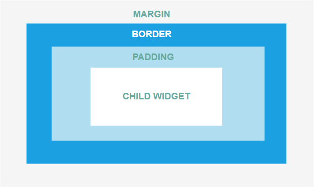
A Container widget is a layout widget that accepts a single child widget. Typically, you use a container widget to add paddings, margins, and borders to the child widget.
Even though a Container widget contains a single child widget, it can include a child widget that has multiple widgets like the Row or Column widget.
The following picture illustrates a Container widget:
The following app shows how to use a Container widget that has a Text widget as a child widget:
import 'package:flutter/material.dart';

void main() {
  runApp(const MyApp());
}

class MyApp extends StatelessWidget {
  const MyApp({Key? key}) : super(key: key);

  @override
  Widget build(BuildContext context) {
    return MaterialApp(
        debugShowCheckedModeBanner: false,
        home: Scaffold(
          body: Container(
            child: const Text('Flutter is awesome!'),
          ),
        ),
    );
  }
}
Code language: Dart (dart)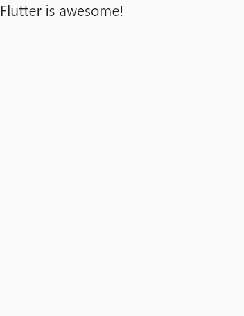
In this example, we have a Container widget that contains a Text widget. By default, the Container widget doesn’t have any paddings, margins, or borders.
Background color #
To change the background color of the Container, you can use the color property:
import 'package:flutter/material.dart';

void main() {
  runApp(const MyApp());
}

class MyApp extends StatelessWidget {
  const MyApp({Key? key}) : super(key: key);

  @override
  Widget build(BuildContext context) {
    return MaterialApp(
        debugShowCheckedModeBanner: false,
        home: Scaffold(
          body: Container(
            color: Colors.amberAccent,
            child: const Text('Flutter is awesome!'),
          ),
        ),
    );
  }
}
Code language: Dart (dart)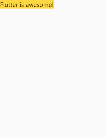
Paddings #
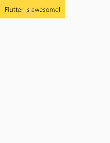
To add paddings to the child widget, you can use the padding property. The Container allows you to add the top, left, right, and bottom paddings. For example:
import 'package:flutter/material.dart';

void main() {
  runApp(const MyApp());
}

class MyApp extends StatelessWidget {
  const MyApp({Key? key}) : super(key: key);

  @override
  Widget build(BuildContext context) {
    return MaterialApp(
        debugShowCheckedModeBanner: false,
        home: Scaffold(
          body: Container(
            color: Colors.amberAccent,
            padding: const EdgeInsets.all(10.0),
            child: const Text('Flutter is awesome!'),
          ),
        ),
    );
  }
}
Code language: Dart (dart)
In this example, we add 10-pixel paddings to each side:
Margins #
To add margins to the Container widget, you use the margin property. Like the padding property, you can add top, right, left, and bottom margins:
import 'package:flutter/material.dart';

void main() {
  runApp(const MyApp());
}

class MyApp extends StatelessWidget {
  const MyApp({Key? key}) : super(key: key);

  @override
  Widget build(BuildContext context) {
    return MaterialApp(
        debugShowCheckedModeBanner: false,
        home: Scaffold(
          body: Container(
            color: Colors.amberAccent,
            padding: const EdgeInsets.all(10.0),
            margin: const EdgeInsets.all(20.0),
            child: const Text('Flutter is awesome!'),
          ),
        ),
    );
  }
}
Code language: Dart (dart)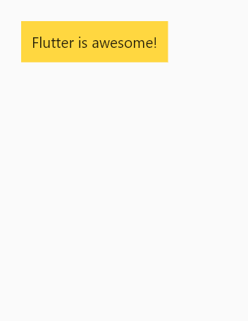
Borders #
To add a border to a Container widget, you use the decoration property that accepts a BoxDecoration object.
The BoxDecoration object allows you to draw a box including a border and other functions like box shadow.
When you use the decoration property, you need to move the color property to the BoxDecoration object because Flutter doesn’t allow you to use both color and decoration at the same time. If you don’t do that, the app will crash.
The following example shows how to add borders to the Container widget:
import 'package:flutter/material.dart';

void main() {
  runApp(const MyApp());
}

class MyApp extends StatelessWidget {
  const MyApp({Key? key}) : super(key: key);

  @override
  Widget build(BuildContext context) {
    return MaterialApp(
        debugShowCheckedModeBanner: false,
        home: Scaffold(
          body: Container(
            padding: const EdgeInsets.all(10.0),
            margin: const EdgeInsets.all(20.0),
            decoration: BoxDecoration(
              color: Colors.amberAccent,
              border: Border.all(width: 10, color: Colors.lightBlue),
            ),
            child: const Text('Flutter is awesome!'),
          ),
        ),
    );
  }
}
Code language: Dart (dart)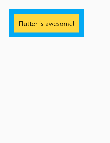
To make the rounded corner, you use the borderRadius property of the BoxDecoration object:
import 'package:flutter/material.dart';

void main() {
  runApp(const MyApp());
}

class MyApp extends StatelessWidget {
  const MyApp({Key? key}) : super(key: key);

  @override
  Widget build(BuildContext context) {
    return MaterialApp(
        debugShowCheckedModeBanner: false,
        home: Scaffold(
          body: Container(
            padding: const EdgeInsets.all(10.0),
            margin: const EdgeInsets.all(20.0),
            decoration: BoxDecoration(
              color: Colors.amberAccent,
              border: Border.all(width: 10, color: Colors.lightBlue),
              borderRadius: const BorderRadius.all(Radius.circular(10)),
            ),
            child: const Text('Flutter is awesome!'),
          ),
        ),
    );
  }
}
Code language: Dart (dart)
The following uses the Container widget to display the Dash which is the mascot for the Dart & Flutter:
import 'package:flutter/material.dart';

void main() {
  runApp(const MyApp());
}

class MyApp extends StatelessWidget {
  const MyApp({Key? key}) : super(key: key);

  @override
  Widget build(BuildContext context) {
    return MaterialApp(
      debugShowCheckedModeBanner: false,
      home: Scaffold(
        body: Container(
          padding: const EdgeInsets.all(10.0),
          margin: const EdgeInsets.all(20.0),
          decoration: BoxDecoration(
            image: const DecorationImage(
              image: NetworkImage(
                  'https://storage.googleapis.com/cms-storage-bucket/d406c736e7c4c57f5f61.png'),
              fit: BoxFit.cover,
            ),
            border: Border.all(width: 8, color: Colors.lightBlueAccent),
            borderRadius: BorderRadius.circular(10),
          ),
        ),
      ),
    );
  }
}Code language: Dart (dart)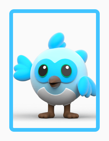
Summary #
- A
Containeris a layout widget that has a single child widget. - Use a
Containerwidget to add paddings, margins, and borders to the child widget.